Headed by Jo Nagasaka who started the firm after graduating from Tokyo University of the Arts in 1998, Schemata Architects not only operates as an architecture firm, but offers interior and furniture design too. Their creativity is visible across the board, blending tradition with creativity to produce a minimal yet substantial style. While you may not have heard of the firm by name, it's likely you've seen their work in Tokyo at least. Responsible for the multiple Blue Bottle Coffee cafes from Shinagawa to Shinjuku, the trendy Aesop and Loft shops in Ginza — their spaces soon become easy to recognise.
Much as they stretch across disciplines, the firm also imposes no limits on the projects they take on, from offices to stores, homes to capsule hotels. Combined with a love for mixed materials and clashing content, it could be said that the only constant in Schemata is their open approach and unique take on space. Despite this apparent flexibility and fluidity, there is an undeniable trend of stripped-back minimalism which is offering an alternative to the flashy metallics of the modern city.
High ceilings, open spaces and surfaces of concrete or plywood are some of the tell-tale signs that Schemata have been and gone, and whether you're a shopper stepping away from crowded streets or a traveller looking for a place to rest — their creations offer a calming escape.
While perfectly normal from the street, their latest capsule hotel ºC in Gotanda is a cave-like renovation with exposed concrete, pillar showers and a decidedly minimal makeover feel. Where new walls were added, they were intentionally left unfinished. And while the majority of the building was updated, the capsules themselves were retained for a retro look. Made in partnership with Nine Hours, the hotel is part of a project to update the capsule-hotel reputation, but refuses to entirely forget its functional focus. Suitably located in a red-light district, the hotel is male only and avoids the generic hotel feel applied to many similar spots due to details like the layered sauna and plywood locker spaces.
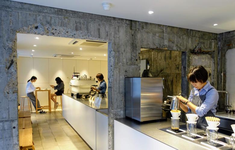
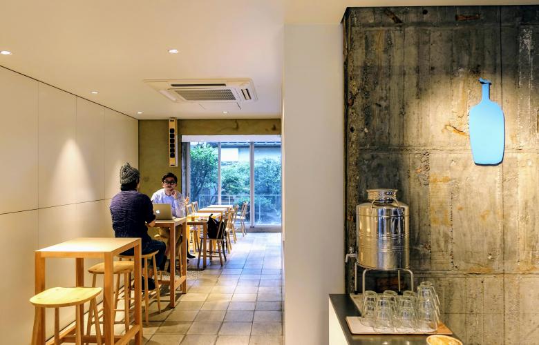
Plywood is a running trend throughout their designs, offering the perfect balance between practical and unassuming with a suggestion of something unfinished. At the Roppongi branch of Blue Bottle, polished plywood is a light alternative to traditional finished wood and offers a more modern style. With start-ups, DIY and entrepreneurs being the height of cool, the desire for an unpolished look seems to be growing. Allowing visitors to relax, plywood serves its function without any pretentions and forms an almost invisible surface — forgotten by the mind's eye as it makes no statements.
In a similar vein, the use of exposed concrete offers an escape from the high-end stores, bringing the concept of luxury design full circle. Abandoning the excessive, the Yagicho Honten store in Tokyo is an eye-catching narrow structure combining concrete, copper and the brand's signature red. A business dating back over 280 years, the company sells traditional dried food from their flagship Nihonbashi store. Stripping the showroom and inserting islands for display and demonstrations, a fluid feel is achieved — encouraging browsing in a relaxed, market-like fashion. Embracing the less-is-more notion, the polished copper accentuates the pitted concrete walls, but the contrast is softened by the red cabinets, creating a warm, aged feel.
That style was also used for the Sangenjaya branch of Blue Bottle, a small space paneled with concrete poured into cedar-wood molds and left with etchings and markings galore. Contrasted with glossy surfaces and state-of-the-art brewing equipment, the overall style is a surprisingly pleasing mix that suggests history with progression. The location — hidden behind regular storefronts with a specially designed concrete path — adds to the off-beat alternative feel.
In the Ginza district — home of high-end stores and glossy design — Schemata enabled Australian skincare store Aesop to turn the tables on what can and can't be luxe in Tokyo. Taking inspiration from the street name, the small store is turned inside out as the brickwork fills the interior. Unpolished and gritty, the red bricks form flooring, walls and counters, opening the narrow store to the busy street both visually and physically. The mortar is left rough, the bricks are uneven and the simple space uses copper fittings and light wood to compliment the colour scheme.
While many companies and design firms continue to move towards glass, polished finishes and sleek white surfaces, it seems the alternative is a very different game. Highlighting the aged, experienced elements of spaces allows for the brands within to absorb a welcoming and unpretentious atmosphere, avoiding the distracting and hollow feel of gloss and polish. While Schemata continue to redesign Tokyo building by building, you may begin to notice a few more of their fingerprints as you explore the city.
By Lily Crossley-Baxter
Similar to this:
Kenzo Tange: Modern Tokyo's past creator
The architects of success: Behind Tokyo's famous landmarks
Waterworks: Fluidity and movement in the designs of SANAA


