Unsurprisingly, many of the most creative library spaces can be found in universities in Japan as they continue to form new spaces for study — be it using traditional texts or multi-media. With thousands of students, multiple disciplines and plenty of options for self-study, group projects and more, the spaces require a flexibility at odds with the traditional library image. Having suffered as the digital trends took over, they are returning as a trendy and popular destination for study but also reading spaces.
With popular new hostels offering the chance to sleep in them and countless coffee-shops recreating their atmosphere, libraries are celebrating a regeneration and throwing off the reputation of silent, stuffy halls. Over the past decade, they have taken on new forms and offer fantastic opportunities for creative flair which attract the country's best architects.
Musashino Art University Library | Sou Fujimoto Architects | Tokyo

Considered to be the best university of its discipline in Japan, Musashino Art University opened its doors to young architects when seeking a design for its new library. Following their tradition, the opportunity was offered specifically to young architecture firms, and the winner was the young but well-known designer, Sou Fujimoto.
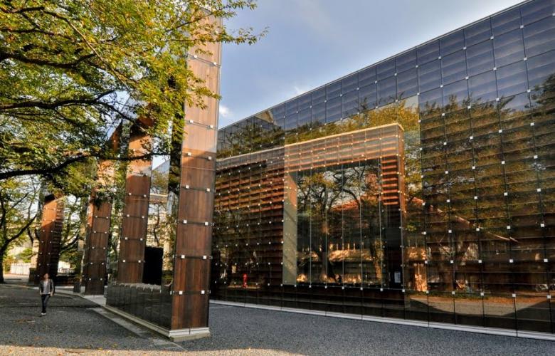
Imagining a light and airy space, he focused on the simplicity of the everyday bookshelf — reducing a library to both its simplest function and greatest offering. The spiral design of the library creates a world of books, with towering 9m shelves stacked with over 100,000 books. The walls are broken with openings, providing shortcuts to new areas and fostering the second of Fujimoto's two key principles of the design: exploration.
Paired with 'investigation', he felt the space needed to combine the two opposing concepts, allowing students to find what's needed, but also to discover new things. The spiral shape allows for distinct sections and a clear path, as well as opportunities to stray and explore.
The double-storey building has a glass exterior displaying walls of shelves, with a basement storing a further 100,000 texts and an overall floor-space of 6,500 m2. Escaping the traditional image of dusty, darkened libraries, this creation is a light and inspiring space, invoking a sense of calm to anyone who walks through its doors.
The Nakajima Library, Akita International University | Mitsuru Senda | Akita

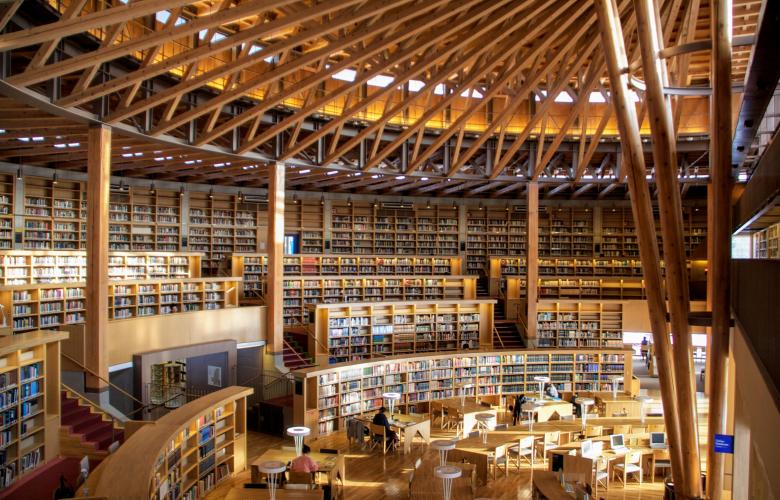
The Nakajima Library at Akita International University is known as the library that never sleeps — as it is the only one in the country that is open 24 hours a day, 365 days a year.
Treating books as the collective knowledge of the past, the design is based on a coliseum, with an amphitheatre built from local cedar wood creating an incredible stage for students and their chosen texts. It is one of only 14 United Nations Depository Libraries in Japan and has over 60% non-Japanese content all housed in beautiful, curved bookcases circling the stage of desks. Like an unfurled summer parasol, the roof is left uncovered, with each wooden beam exposed to form an intricate pattern above.
While the option of working 24-hours a day throughout the year may seem stress-inducing, the calm and natural atmosphere of the library, created by the cedar and natural shape, avoids this entirely. By designing a welcoming and open space, Senda succeeds in fostering a creative space for collaboration and study which embraces all forms of learning. The library is open to the public and students, and offers outdoor study spaces too, ensuring nature is always present.
Designed by Mitsuru Senda, the building has won many awards including the JIA Award, the Good Design Award and the International Architecture Award in 2010.
Tama Art University Library | Toyo Ito | Tokyo

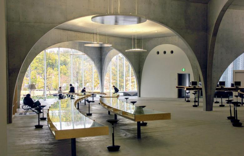
Cathedral-like in its design, the Tama Art University Library is an impressive combination of sleek, modern elements and nature-based inspiration. Required to house staff and students of all disciplines and include both traditional texts and modern technology, the space needed to combine contrasting elements. This consolidation of concepts is a visible theme throughout, with practicality and creativity working together to create an open and inviting space for all.
The striking arch-based design is formed of 166 concrete-covered steel arches, with spans ranging from 1.8 m to 16 m, but all tapering down to 200 mm bases. Designed in tandem with a structural engineer, they are able to share the weight evenly across the intersecting points, and their narrow forms reflect the stalactites which inspired their original design. This uniform but varied design creates a space both open and sectioned, without doors but with suggested divides. Originally intending to build the space underground, Ito's concept was based on a cave-like design but was created on the first floor due to budget restrictions.
Geometric and classic bookshelves break the standardized expectation of row after row of books, with open spaces circled by collections in curved cases, dotted with tables and flowing river-like desks. A combination of communal desks and individual media chairs with screens allow for the varying needs of students, with selections of the latest magazines offered in the first-floor gallery to tempt in passersby, who are able to stroll through freely.
At first glance, the building's exterior is made of stark lines, with a ship-like hull formed by two walls meeting to create a sharp edge. There is a curve to this view too, however, and the arches — fronted entirely with glass, create a series of tunnel-like spaces to peer into or gaze out of. Fantastic sources of natural light, the space both merges and is divided from the outside world, welcoming visitors and allowing those within to view the world beyond their desk.
Seikei University Library | Shigeru Ban & Mitsubishi Jisho Sekkei | Tokyo
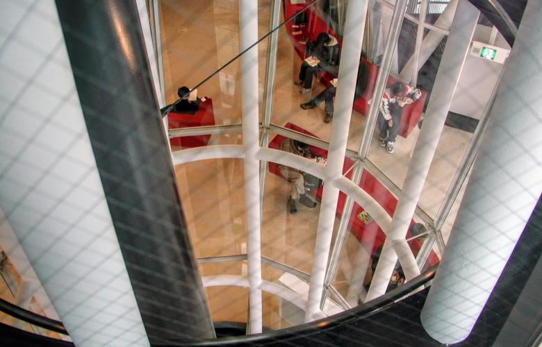
Visually, but also literally, the futuristic design of the Seikei University Library creates a space within a space as meeting domes float in the glass-fronted atrium. Designed by former student Shigeru Ban alongside Mitsubishi Jisho Sekkei architectural firm, the library was a celebration of the private university's centennial in 2006.
Famed for his incredible work on the Centre Pompidou-Metz in France, Ban's architectural firm has designed many art spaces across the world, including the Osaka Shin Art Museum, La Seine Musical, Aspen Art Museum and the Tokyo Design Museum.
This interest in creative spaces is demonstrated through the creativity at work in each design, and the Seikei Library is no different. The pods that take center-stage even feature a play on words for their title: called planets, they are both celestial bodies and spaces for plan(ning) and net(working) — showing that no space has a singular purpose.
While libraries are considered silent spaces for study, the university wanted to encourage students to discuss and debate what they learn with each other, fostering an environment of development and growth. The planets are meeting rooms, with large tables, projectors and whiteboards, perfect for meetings and group study by students, teachers or both. The focus of creating a space for speaking within a space for studying allows people to develop ideas without disturbing others.
The transparency of both the atrium space itself and the pod roofs allows for natural light and a sense of openness, ensuring those in the pods still share the space, and nothing is separated.
Click here to see photos of the library.
Minna no Mori Media Cosmos & Sendai Mediatheque | Toyo Ito | Gifu & Sendai
Minna no Mori Media Cosmos

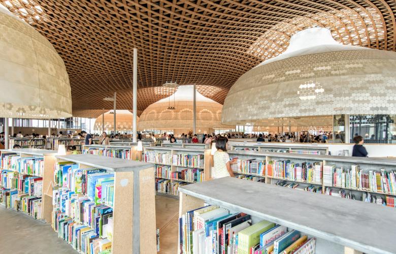
A community centre and library, the Minna no Mori Media Cosmos is a creation of Toyo Ito, renowned architect and creative genius. Meaning 'Everyone's Forest', the design reflects the surrounding landscape and was built to create a natural space for the community, taking inspiration from nearby Mount Kinka and using natural resources like Japanese cypress.
The space features a wave-like wooden-latticed ceiling, with hanging domes which filter light into the different "knowledge hubs" they hover above. Shaped like hanging lampshades, the globes feature different designs inspired by their function and float above workstations in different sections, while also acting as reference points on maps and filtering hot air out from the workspace.
The building is more than just a library, however, as it is a place for the community as a whole, with different sections highlighted with specially designed signs and labels, located on floors, shelves and circular signposts above doorways. The fluid theme of the space is continued with seating areas and bookshelves, with no fixed spaces or square partitions — creating an open and explorable space for all who enter.
Sendai Mediatheque

Similarly, Sendai's Mediatheque, also designed by Toyo Ito, combines technology and text in a space open to the local community. Designed back in 1995, Ito's creations was chosen from 235 other proposals by public consultation and was completed in 2001.
The entirely transparent building houses an art gallery as well as a library and is famed for having no traditional pillars, being hailed as revolutionary in both design and engineering.
The six floors appear suspended in mid-air but are supported by thirteen latticed towers of varying width and spacing. The structural supports fluctuate in diameter as they reach through the building, reminiscent of trees in a forest, growing and twisting with time.
The building won many awards due to its focus on fluidity between spaces and functions, and is a clear influence on later designs, including the Media Cosmos in Gifu.
By Lily Crossley-Baxter
Similar to this:
Architecture through the ages: The Edo-Tokyo Open Air Architectural Museum
Tokyo: Capital of modern Japanese architecture
Weird and wonderful: Japan's unconventional houses

